
Yes, I made another thing! By thing, I mean I made something cool for MÖRK BORG. By something cool, I mean I spent a lot of time—possibly too much time—on a new class along with some new equipment, weapons, powers, things to kill you, and some additional mechanics. It’s all inspired by science-fiction, cyberpunk, psychic powers, psionics, etc.
The class is comparable to a cheeseburger—it’s an artificial post-biological horror.
Some nice gamer(s) bought my #MorkBorg PDFs. If you’re out there, thanks!
Now I could either buy a cheeseburger or @greysonwhy‘s Psyber Devangelist.
Both will be artificial, post-biological horrors. But only one will give me heartburn.https://t.co/iUASSy03iN
— Līber Lūdōrum ?? (@LiberLudorum) October 16, 2020
I also greatly appreciate the outright support because this is the closest thing I have to income right now, and I am at least trying to make fun things, build a portfolio, and earn enough off of my work that my hobby is self-sustaining. And the work. Because I had to buy better software instead of using something that’s meant for making slideshows.
First and foremost, I need to say that Evlyn Moreau and her Orbital Megastructures have been my biggest inspiration. I’ve always loved science fiction, but it always felt out of reach in terms of tabletop RPG playability—for me, that is. Running science fiction as a GM feels tough to me. There’s so much to remember, so much to consider, so much to… Well, it’s not medieval fantasy, and that’s just everywhere. I can remember swords. I can remember spells. But I (at least thought I couldn’t) remember security systems and commlinks and all that stuff. Well, Evlyn makes it look and feel so easy, and I think doubly so because I think she is a great GM and I think she has created (or is creating) a great game. (It is also semi-post-apocalyptic, which is also an easier way to manage futuristic themes.) The very process of playing a game like that got me so excited to create something sci-fi-ish of my own.
Also, I used a ton of her lovely art.
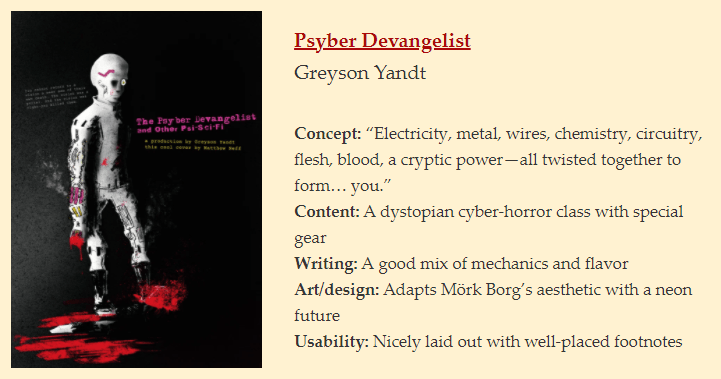
And then there’s the great cover art by Matthew Neff. What a lovely Discord notification to get. Oh, some person on the Discord made art inspired by my class, and they let me know that it’s totally cool if I want to use it. Did I cry? Yes. Yes, I did.
But, yes, I love sci-fi. I love Neon Genesis Evangelion, I love Bionicle, I love Cyberpunk, I love Shadowrun, I like Star Wars, and I even like making references to things I don’t know much about like Warhammer 40k. There are a few loving references to Orbital Megastructures, there’s another reference to Ultraviolet Grasslands, and there’s a secret reference to my first GURPS campaign*.
*The first background for the Psyber Devangelist mentions being unable to return to a vision that a seer saw of their own death. That goes back to the Eire Era (the unofficial name that my best friend and I gave our campaign ran by his dad). One of our several characters—we each had a couple—used the Death Vision spell in a wild mana zone. Probably not the best idea. We saw a vision of Jack (my best friend’s first character) as a cyborg, but he stepped through the Death Vision as if it were a portal, and he tried to kill us. He almost succeeded too. CyberJack went nuclear, but one of my characters was able to call in a wave and then freeze it over him.
Anyway, it’s all in there. As well as a mechanic inspired by Darkest Dungeon, which I recently beat by cheating my way through it.
Returning to GURPS for just a second, let’s just say I’m very inspired by the system as a whole. I often use it as a reference point, like oh, this rifle does twice as much damage as this pistol—I’ll remember that. The less I play GURPS, the more I appreciate it as if it is a game design toolkit.
Oh, and I threw in Advantage and Disadvantage because I was quite surprised that MÖRK BORG didn’t have them out of the box. Double oh, and I threw in Energy Dice based off of Risk Dice based off of Usage Dice. That’s the power of evolution.
This whole project evolved, and I hope it shows. As you leave the class and get into page 3, there start to be neon green symbols. Then, on page four, the symbols and the text boxes are starting to glow. I have a lot of fun with design—pretending like I know what I’m doing. That’s actually not even true. I don’t pretend. I just try to make things that I would like.
But what about the other stuff?
The cover title was added last, so I played with a couple of extra fonts to tie together a cyber-horror feel to intro into the funkier bits in the actual content. The title on page 1 just uses some funky fonts to evoke that sci-fi feeling. My main font is my go-to font, but it turned out to be a dumb font that doesn’t even have an italic style, but at least I learned how to shear! There might be maybe two text boxes in the whole thing that don’t have some kind of rotation to them. I love the way rotation makes the text look. I used text highlighting, and I cheated a lot, adding in non-breaking spaces to help pad out some areas that needed adjusting. For colors, I kept to the black, white, pink, and yellow for the most part. A compatible cyan-blue-ish color gets tossed in to grab your eyes toward important notes. Of course, I made generous use of bolding as well as small caps to draw attention to certain things. Finally, on pages 3 and 4, for the creature titles, I used a more blackletter-y font to tie the idea of these strange horrors back to the MÖRK BORG feel.
And how about a review of a review?
That’s a good review.
I’m pretty proud of what I’ve made, and I appreciate that others enjoy it as well.
Leave a Reply